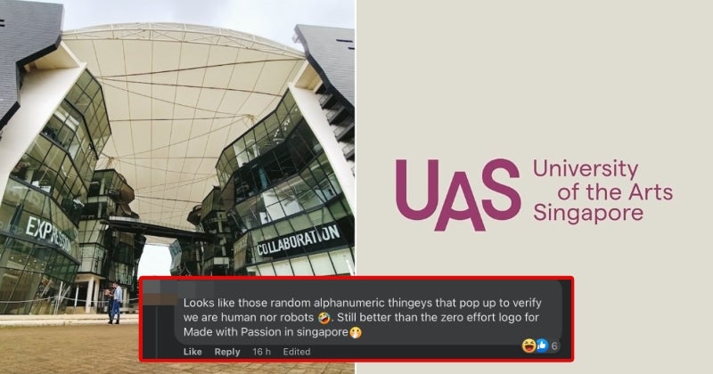
University of the Arts Singapore (UAS), a brand-new university in the island state focusing on, well, the arts, just unveiled its logo recently and it has been met with mostly negative reactions.
Unveiled by the new university on Wednesday (10 May), the logo is not exactly what you’d expect from an art school and features minimal branding with the university’s initials on the left and its name in full on the right.

According to Yahoo! News, UAS elaborated that the logo represents the “dynamic spirits of an arts education” that never stands still, as well as the “dynamism of an arts education”.
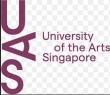
Moreover, UAS through its official Facebook page also said that the ‘A’ in the middle of the logo symbolises both the creator and beholder of art as it can be seen as both the tip of a pencil or the shape of an eye.
However, despite the explanation behind the design, many netizens are simply not a big fan of it and labelled it as lacklustre and bland, with some even going as far as calling it ‘lazy’.

Senior culture correspondent for The Straits Times, Ong Sor Fern took to Facebook to start a discussion on the logo, saying that the logo had left her with ‘no words’.
Well, the three shocked emojis she put in the post should allude to her thoughts on the logo.
In the comments section, one netizen said that the logo reminded her of the random alphanumeric CAPTCHA verification that you have to key in on certain websites.
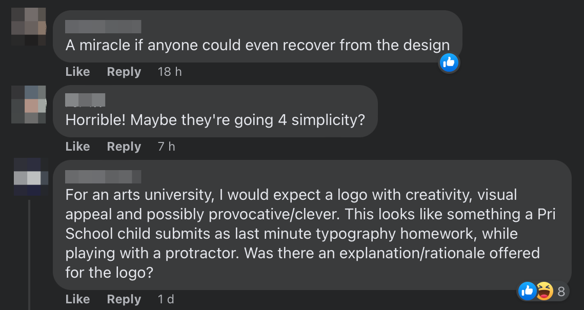
Another commenter sarcastically said that UAS wanted to communicate a “bland corporate entity, desperately trying to be cool and relevant”, while another straight-up called it “horrible” while assuming that the university was going for simplicity.
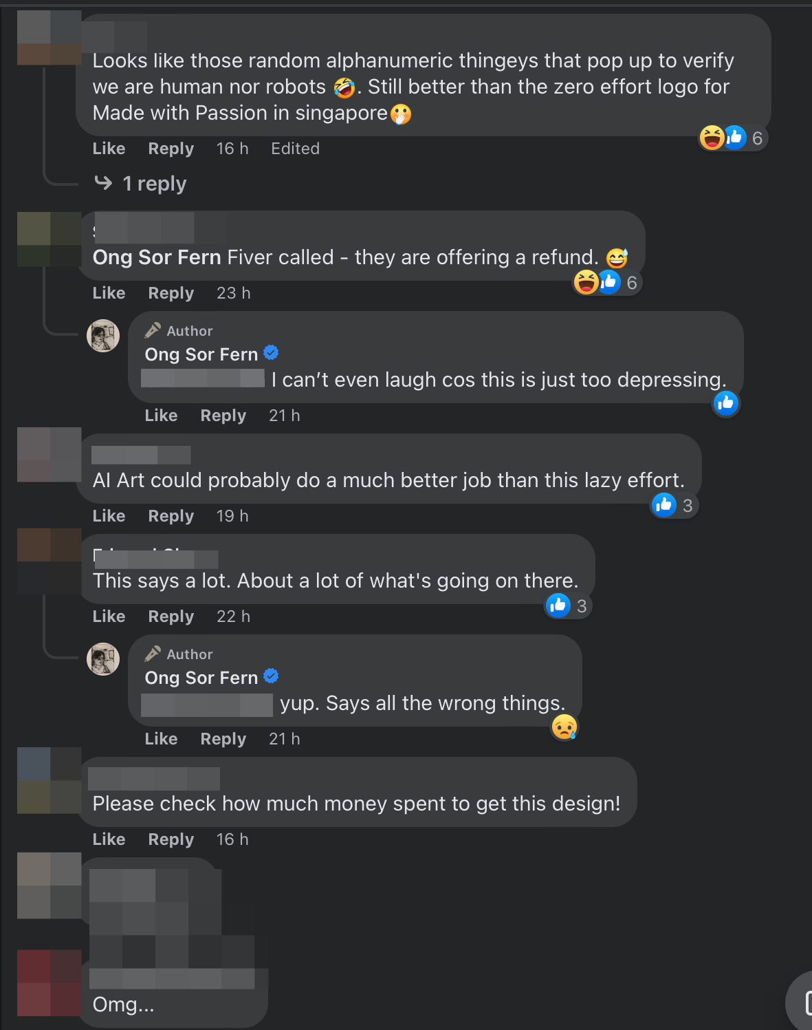
Besides that, one commenter believes that the university could’ve come up with a better logo by simply using generative AI tools.
One of the harsher comments asserted that the logo is not befitting of an arts university as one would expect it to exert creativity, visual appeal and possibly be provocative or clever. Instead, UAS’ logo looks like “something a pre-school child submits as last minute typography homework while playing with a protractor”. Ouch!
So, what do you guys think of the logo? Is it really that bad or are the comments being harsh? Share your thoughts with us in the comments!
Also read: KTMB’s New MyRailLife Pass Logo Has Unclear Design; M’sians Think It Means Something Else

