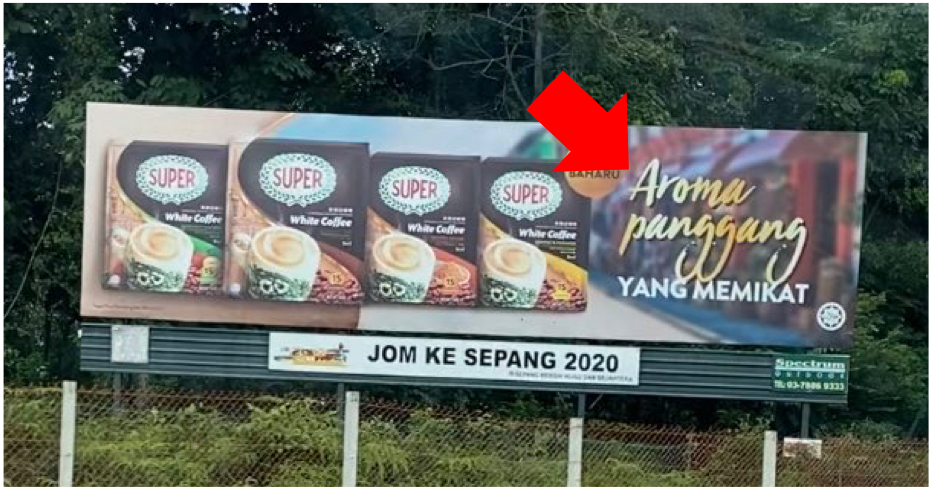
Apart from the wording within the messaging, the font chosen to showcase the intended message plays a huge role too. Previously we did witness a great campaign, #AnakMalaysia, that got ruined by the font that they used. This time, a billboard of a brand on PLUS highway is getting all the attention but for the wrong reasons.
The coffee brand promises all fans that their coffee will come with an aroma that satisfies all. With the tagline “Aroma Panggang Yang Memikat” which supposedly translates to “A Roasted Aroma That’s Tantalizing”, the billboard surely will attract all the attention. However, a wrongly selected font caused the word “panggang” to be seen as “punggung” which also means butt.
The issue was highlighted by Twitter user, Fadzilah Mamat, after she saw the billboard on the road and decided to take a picture of it. She tweeted,
“Whoever designed this, we need to talk about the font selection.”
However, her tweet has prompted replies from the designer community which mention that it is not the designer’s fault but those who direct and approve the finished visual.
Bukan salah designer, salah orang yang approved kerja ni ? kasihan lah kami designer asyik dipersalahkan sedangkan kadang kala client yang nak macam tu walaupun kita dah suggested lain ?
— Liyana Rahman (@LinkitMy) December 15, 2020
We do agree that most of the time, designers have to follow the direction of their superiors or clients. Although they can advise on what’s the best elements to use, most of the time, they will be vetoed by everyone mentioned earlier. Hopefully, the brand is listening to public opinion and choose a better font next time.
Also read: This #AnakMalaysia Poster Is Going Viral For Its Design Flaw, iQIYI Issues Public Apology


