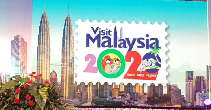
If you have been scrolling through social media recently, you would have noticed the new Visit Malaysia Year 2020 campaign logo that was unveiled by Tourism and Culture Minister Datuk Seri Nazri Aziz at the Asean Tourism Forum (ATF) 2018 in Chiang Mai, Thailand on January 26th.
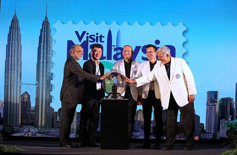
Source: the sun daily
The logo is in the shape of a postage stamp with a drawing of an orangutan hugging a proboscis monkey. A drawing of a turtle can be seen in the bottom right corner of the stamp, and all three animals are wearing sunglasses. Because Malaysia is hot, we’re guessing?
The colourful emblem also has a silhouette of the Petronas Twin Towers and the words “Travel. Enjoy. Respect.” are written at the bottom.
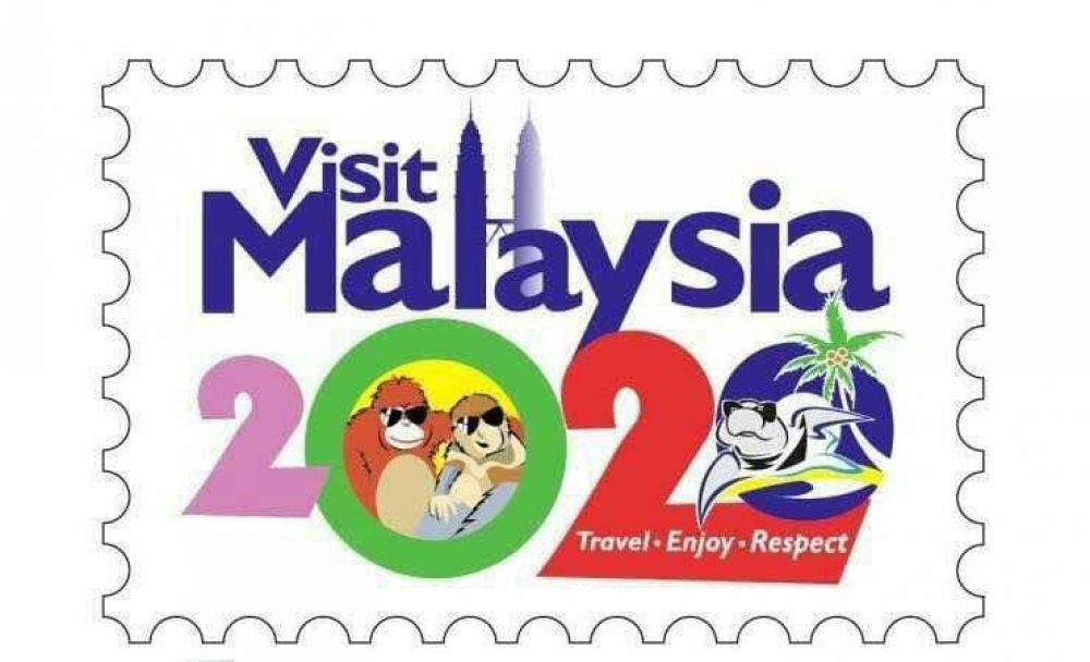
Source: malaysian insight
This logo was not well-received by many Malaysian netizens, who said things like,
“I’m sick and tired of this humiliation. How can you be a minister, when you can’t realize how awful & humiliating this logo is?”
“You know what this says to the world for 2020? Malaysians can’t design. I weep for all our great graphic designers.”
Another one said, “This is the Visit Malaysia 2020 logo, friends. It is a humiliation when we as graphic designers see the work that is produced. Pity us when we spent thousands studying graphic design but logos like this are produced.”

Source: twitter
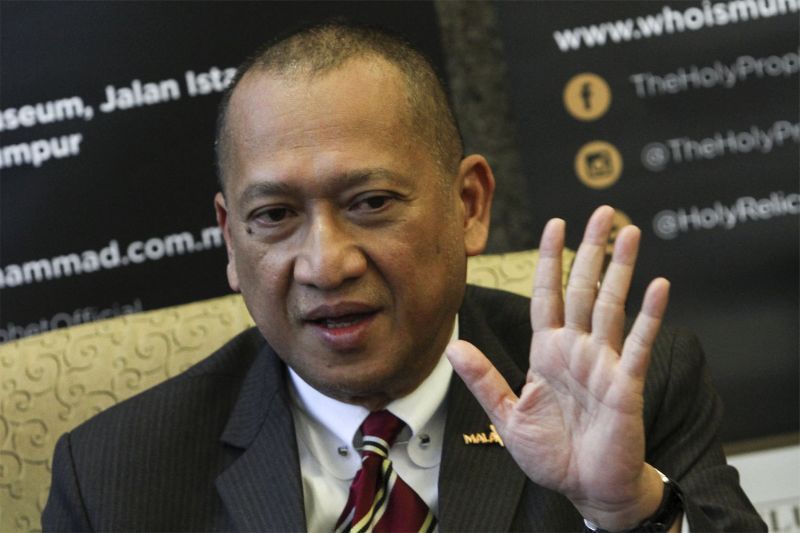
However, the Tourism and Culture Minister was unfazed by the criticism and stands by their decision to make this the logo representing Malaysia in international circles. According to The Star, Nazri said,
“Criticism is normal, we cannot get the consensus of the whole of Malaysia. If we want to wait for everyone to agree, even by 2020 it (the logo) will not be completed.”
Don’t worry though, apparently the Ministry did not spend a single extra sen on the logo as their in-house design team created this work of art.
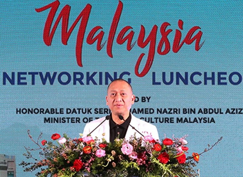
Source: mmo
“We have our own in-house design department and they were responsible for designing all the logos from the first Visit Malaysia Year (in 1990), until this, which is the fifth. We didn’t pay any advertising house any money at all to design it. I’d rather trust my staff than the netizens. Anyway it was never meant for the locals, it was meant for tourists,” he added.
When asked, Nazri said that the logo was in line with the iconic symbols of Malaysia, saying,
“We retained the Petronas Twin Towers in the logo as it is the most photographed tourism product in Malaysia. We have to be proud of the twin towers just as the French take pride in their Eiffel Tower.”
“The animals were symbols used in previous campaigns and we decided to use them because they are iconic in Malaysia.”
Source: yahoo
What do you think about the new logo? Yay or nay? Let us know in the comments below!

