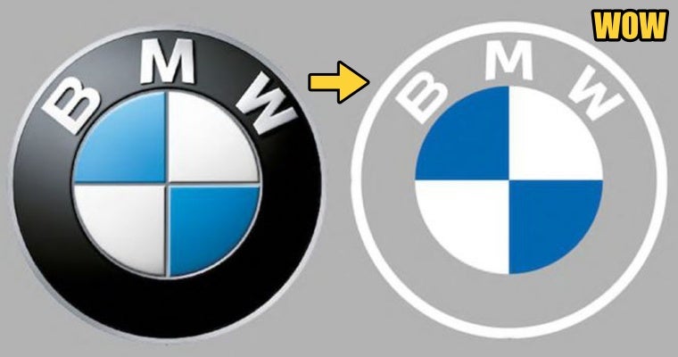
BMW is a luxury car brand to most of us peasants, we mostly only know the brand by its iconic logo. However, the company decided to make the biggest change ever in 103 years since the logo’s introduction in 1917, by making the black border transparent and removing the dated 3D lighting effect.
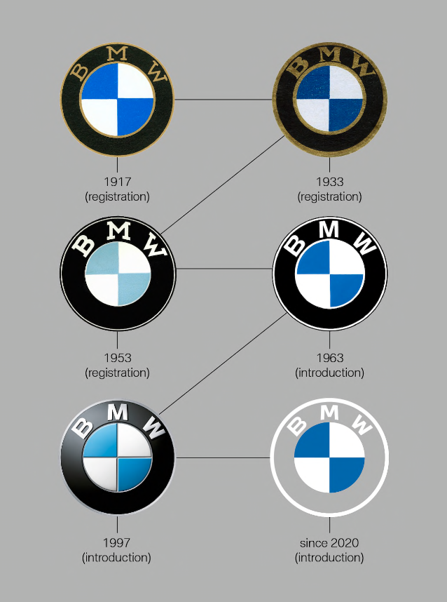
Most of us only knew about the existing BMW logo — the one with a black ring and a classy 3D look. Little did we know that the logo had undergone 6 changes throughout history, and the 2020 version is deemed the most shocking one as it has become flat and minimal. The only components that remained were the “BMW” brand name and the white and blue colours that represent white propellers and blue sky.

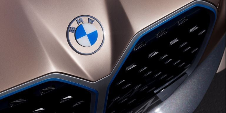
According to Creative Bloq, BMW had revealed its brand new logo in conjunction with the release of their i4 concept car and the transparent logo was designed to “radiate more openness and clarity”.
You might be wondering: WHY such a drastic change?!
Graphic designers actually celebrate the change as this new look catches up with the trends in the graphic designing industry because it increases the logo’s versatility.

While we’re still shook about the change, we thought this may be fake news, until we checked BMW’s official site. The introduction of the 2020 logo was made by Jens Thiemer, the Senior Vice President Customer and Brand BMW:
“With this new transparent variant, we want to invite our customers more than ever to become part of the BMW world. In addition, our new brand design is geared to the challenges and opportunities of Digitization for brands.”
Other than digitisation, BMW also has plans to use this logo offline and online in the future.
“We are equipping ourselves flexibly for the wide variety of contact points in communication at which BMW will show its presence online and offline in the future.”

What do you think of the new logo?
Also read: The Evolution of Proton: How Our National Car’s Logo Changed Through 1983-2019


